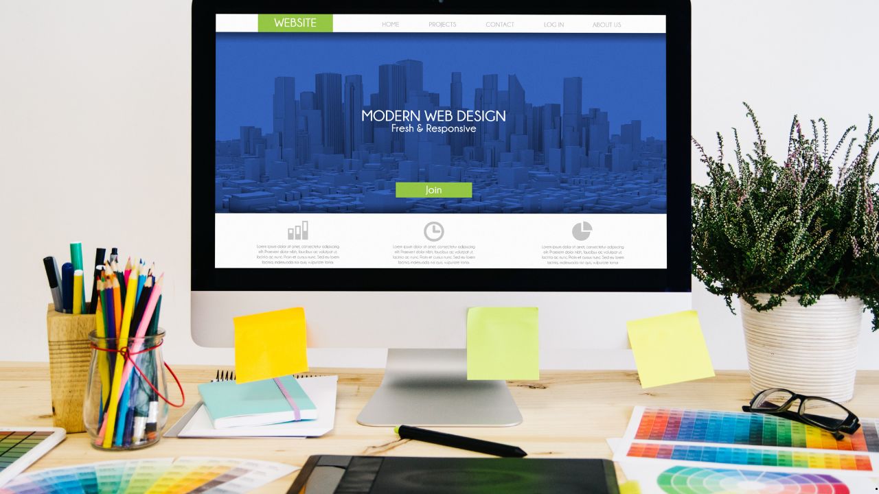
A premium theme isn’t about “looking better,” but about a sense of control, precision, and calm confidence when a website looks like it was handcrafted, not just a stray piece of work. Typically, the desire to “make it more expensive” doesn’t arise out of whim, but because the product has already matured: the content has become stronger, the services more expensive, the audience more demanding, and suddenly a simple theme begins to perform at a “normal” level. At this point, many people start looking for a new theme, opening directories, typing download nulled WordPress themes and hoping that simply installing “premium” will make the magic happen. But the real “looking expensive” effect comes not from the theme’s price tag, but from a set of specific decisions in typography, rhythm, grid, color, and small interactions that come together to create a sense of quality.
Table of Contents
Premiumness Is, First And Foremost, A Visual Discipline
A website can be minimalist and still look cheap. Conversely, it can be busy and look very expensive. The difference is almost always in discipline. Premium design is perceived as a lack of fuss: even margins, predictable element states, neat headings, consistent corner radii, a consistent icon style, and a calm hierarchy. When elements behave consistently across the board, the brain receives a signal: everything is under control.
Surprisingly, this can be put together without a designer if you stop thinking in “theme blocks” and start thinking in “systems.” A theme is a set of rules. The premium effect occurs when you make the rules a little stricter and the exceptions a little less frequent.
Typography That Makes You Look Expensive Overnight
The first thing that enhances the perception of quality is the text. Even with a perfect layout, a website will look sloppy if the font is too random, the line spacing is tight, and the sizes fluctuate.
A common mistake is “too big and too bold.” Premium quality rarely screams. It’s read in precise proportions: headlines don’t have to be huge, they should be clear. A good technique is to slightly reduce the weight of headlines and compensate with appropriate spacing around them. When a headline isn’t pressed against the paragraph and has some breathing room, it’s perceived as more “expensive” than one that’s simply bold and large.
The second technique is to stabilize line length. On wide screens, text can stretch, making reading feel like “sliding on ice.” A premium website often maintains a comfortable content width: lines aren’t too long, paragraphs don’t become canvases, and the visual rhythm becomes calm.
The third technique is careful emphasis. If every other sentence on a page is bolded, italicized, or highlighted, it becomes noise. Premium style is built on rare and precise accents that truly contribute to, rather than replace, the structure.
Air And Rhythm: Indentations Matter More Than You Might Think
“Expensive” almost always means “spacious.” But it’s important not just to increase the margins, but to make them consistent. When blocks are sometimes 18 pixels apart, sometimes 33, sometimes just “as it fits,” it ruins the overall feel of the system. In a premium interface, margins are like music: they repeat, set the tempo, and don’t falter.
The practical logic here is simple: the page should have a noticeable vertical indent. Sections are separated by larger indents than elements within them. Within a card, the indents are smaller than between cards. The heading is separated from the text just enough to be a heading, not the first line of a paragraph. Once you establish this rhythm, even a simple template begins to look thoughtful.
Sometimes the theme gets in the way here: it may have built-in indents that are difficult to overcome without additional styles. Then you have to approach things gently: don’t rewrite everything, but choose two or three key areas where rhythm is most important and systematize them. Typically, these are the header, the first screens, the cards, and the footer.
Card Grid: How to Avoid Turning Your Page into a Chaotic Display
Cards are the main source of the “catalog-like” feel. And they’re often the ones that give away the theme: different heights, different buttons, different margins, images cropped haphazardly. A premium look begins with cards becoming a cohesive family.
First, it’s important to decide what constitutes the card’s “skeleton”: an image, a title, a short text, metadata, an action. When these elements are in the same order and position on each card, the visuals stop “dancing.”
Secondly, it’s helpful to simplify. Paradoxically, premiumness often emerges when you remove unnecessary elements: a second button, an extra icon, long passages of description, and all sorts of other clutter. The less a card tries to convey, the more expensive it appears. A card should make a promise, not explain everything on the tile.
Third, it’s important to organize your images. Either use a consistent format and cropping, or remove images where they appear random. Premium design doesn’t tolerate “mismatched images,” especially in a grid.
Color and Contrast: Premiumness is a Controlled Palette
Many people think that “expensive” means dark backgrounds, gold, and gradients. Sometimes this is true, but more often, premium is perceived as subtle contrast and a limited palette. Not because it’s “fashionable,” but because the limited palette reduces visual noise.
A helpful rule of thumb: a website has a base text color, a secondary text color, a background color, a surface color, an accent color, and a border color. That’s it. When a theme introduces ten shades of gray and three “almost identical” blues, the premium effect is diluted. You win by distilling everything down to a few key values.
A separate consideration is the contrast between text and background. Too much contrast on a pure white background can create a feeling of “cheap sharpness.” A slightly softer background and text that isn’t pitch black are often perceived as more refined, as the visuals become softer but not more blurred. The key is to maintain legibility.
Icons And Graphic Details: A Unified Language Instead Of A Collection Of Randomness
Icons often ruin the premium look even on expensive themes because they’re pasted from different sets: some have thin lines, others have a solid fill, and others have different angles. As a result, the website looks like a collection of components from different universes.
A good trick is to choose one style and stick to it everywhere. If your icons are linear, they should all be the same thickness. If they’re filled, then they should all be filled. If they have rounded edges, then they should all be the same. It seems like a small thing, but the brain is very good at spotting inconsistencies in the “language of objects.”
The same goes for shadows, borders, and roundings. When a button has one radius, a card has another, and a form has a third, it creates a constructor-like feel. The premium look is repetition.
Microinteractions: What Looks Expensive Is What Acts Confidently
Microinteractions are small interface reactions: hovering, tapping, focusing, tooltips appearing, and menus opening smoothly. Their value lies in the fact that they create a sense of product-like quality. The website begins to resemble a well-assembled service rather than a template-based page.
Expensive experiences are often built on very modest animation. Even small effects can elevate your site; understanding motion design trends helps make these microinteractions feel intentional and premium. Smoothness should be short and predictable, without jumps. Hovering over a card can slightly change the shadow or lift it slightly, but not turn it into a show-stopping experience. A button can slightly change its hue or brightness, but not “flash.”
Another important point is form field states. A form that doesn’t respond to focus at all, or responds rudely with a thick blue border “like the browser,” looks cheap. A premium website carefully considers focus, errors, tooltips, and input states. This is where themes often have weak default solutions, and it’s here that a little customization can make a big difference.
Where A Premium Theme Suddenly Limits Your Freedom
The paradox of a premium theme is that it simultaneously provides a foundation and takes away freedom. At some point, you encounter “fixed templates”: the header isn’t how you want it, the cards don’t rearrange themselves as expected, the typography can only be partially changed, and some blocks don’t offer adequate control over spacing.
Sometimes, if you need full control over your design, hiring a custom website service can help bypass the limitations of even premium themes. The first is global styles, which the theme applies too aggressively. You edit a button in one place, but it breaks in another because everything is tied to a single shared class. The second is the page builder: there are beautiful blocks, but their parameters are rigid, and you feel like you’re setting up a storefront rather than a design system. Pay attention to mobile design best practices, because even premium themes can create unexpected layout issues on smaller screens.
The “minimal war” strategy helps here. Instead of trying to customize the theme everywhere, find the areas where premium design is most important for the overall experience. Typically, these are the first screen, service or catalog pages, cards, forms, and the footer. These are the areas where fine-tuning is needed. The rest of the site can be kept a bit simpler—users rarely judge “expensiveness” by the privacy policy page.
What’s Better To Simplify So That It Immediately Becomes More Expensive?
There are elements that people want to complicate, thinking that complexity equals premium. But often the effect is the opposite. Simplification increases value because it reduces the number of visual solutions per square centimeter.
A very typical example is buttons. When three different button styles, plus different sizes and colors, appear on the screen, the site looks like a collection of options. A premium interface typically has one primary style and one secondary. Everything else is just variations, not new entities.
The same goes for typography. If a website has five different font sizes for nearly identical text, the eye starts to stumble. Premium design is when you have a clear hierarchy: heading, subheading, body text, and caption. And each type of text is used consistently.
Another candidate for simplification is decorative elements. Lines, dividers, extra frames, and unnecessary icons next to each item—all of this easily transforms a page into a “2016 interface.” A premium feel is best built on emptiness and precise accents.
How To Understand That The Feeling Of Quality Has Already Increased
There’s a simple test: when you scroll a page, your eyes shouldn’t get tired from the “jumps.” If blocks change smoothly, elements are repeated, cards don’t clash, the text reads smoothly, and interactions behave predictably, you’ve already got the feeling of a high-quality product. And this can be done without a designer, because it’s more about editing and consistency than artistic taste.
A premium theme is a powerful branding tool when you use it as a foundation for discipline: align typography for legibility, spacing for rhythm, grid for order, color for palette, and details for a unified language. Then, “normal” becomes “expensive-looking” not because of effects, but because of the feeling that everything on the site is in its place and nothing clashes with one another.