Key Takeaways
- Side navigation patterns are essential for efficient mobile app navigation.
- Choosing the right pattern depends on app complexity and user behavior.
- Best practices include simplicity, consistency, and accessibility.
In today’s fast-paced mobile landscape, clear and intuitive navigation is crucial for delivering exceptional app experiences. Selecting the right side navigation pattern sets the foundation for how users explore app features, manage content, and interact with an interface. Side navigation systems, such as the popular side menu UI, play a pivotal role in balancing content accessibility with a minimalist design that doesn’t distract users from core tasks.
Mobile users expect streamlined journeys through apps, and the design of your navigation can either boost engagement or push users away. Thoughtful planning around navigation patterns is essential. Knowing when and how to use side navigation approaches helps maintain a clean interface while organizing app actions and destinations. Well-crafted side menus seamlessly blend usability with visual clarity, ensuring the app feels approachable and responsive to every user’s needs.
Table of Contents
Understanding Side Navigation Patterns
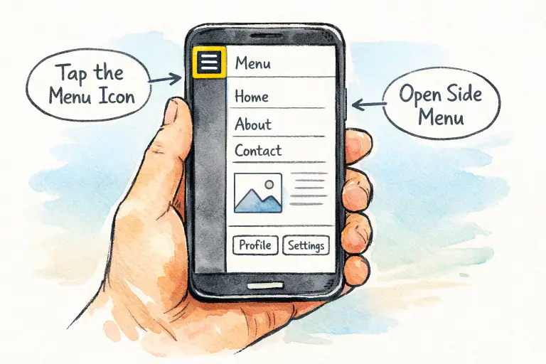
Side navigation, often called the hamburger menu or side drawer, remains a fixture in mobile UX. This approach tucks away navigation links in a hidden panel that slides in from the edge of the screen. By keeping secondary actions and less-frequent destinations out of view, these menus provide more space for primary content and diminish cognitive overload. For app users, the result is a less cluttered environment and a clear path through core workflows.
Despite its popularity, the effectiveness of side navigation depends on implementation. For example, a Smashing Magazine analysis emphasizes that when menus are hidden, users may not immediately discover essential navigation options. Crafting a side navigation that balances visibility with simplicity is critical for a positive experience. Understanding modern URL navigation guide principles also helps designers think more clearly about how users move between screens and access key features efficiently within an app.
Common Side Navigation Patterns
Several distinct navigation styles have taken root in mobile interface design. Each serves unique user needs and content hierarchies:
- Hamburger Menu: Accessed via a three-line icon, this standard solution reveals navigation choices on demand. It is most effective for secondary or less-frequent sections.
- Side Drawer: A broader take, the side drawer contains a vertical stack of navigation links and sometimes a user profile or utility actions. It is well-suited to apps with more sections that need organization.
- Vertical Split Navigation: This pattern divides the screen, offering a persistent secondary navigation bar alongside content. It is effective in scenarios requiring access to multiple navigation levels at once.
Pros and Cons of Side Navigation
Like any design solution, side navigation offers notable advantages as well as certain drawbacks when compared with other navigation systems.
Pros
- Space Efficiency: By tucking navigation away, designers free up screen real estate for core content. This is particularly valuable on smaller mobile displays.
- Scalability: Side menus accommodate a wide range of navigation options, making them flexible for growing or complex applications. This is especially relevant for apps that expand features over time.
- Familiarity: Given their widespread adoption, most users quickly recognize and understand how to interact with hamburger menus or side drawers.
Cons
- Discoverability Issues: Hidden menus can go unnoticed, especially by less-experienced users. Key features risk being buried, lowering engagement.
- Increased Interaction Cost: Accessing hidden menus generally requires extra taps, which can be a minor obstacle in fluid user flows.
- Inconsistent User Experience: Varying placements, iconography, and animations across apps cause inconsistency that may confuse users, as highlighted in research from Nielsen Norman Group.
Best Practices for Implementing Side Navigation
Effective side navigation does not appear by chance. Designers should follow solid mobile design principles to improve usability and reduce friction. Applying strong mobile responsive design practices ensures that side navigation behaves consistently across different screen sizes and devices, creating a smoother user experience overall.
- Prioritize Content: Reserve the most accessible spots and places of prominence in your navigation for the app’s most vital destinations.
- Maintain Consistency: Leverage universally recognized icons, gestures, and menu positions, so users can rely on prior experience and habits.
- Optimize for Thumb Reach: Recognize that most users operate their device one-handed; interactive touchpoints should be reachable and tap targets large enough for confident use.
- Provide Visual Feedback: Actively highlight the current section within the menu. This orientation technique keeps users aware of their place in the app at all times.
- Test Across Devices: Rigorously evaluate the navigation pattern on different devices, screen sizes, and orientations to guarantee a universally robust experience.
Case Studies: Successful Side Navigation Implementations
The world’s most-used apps demonstrate the power of side navigation when executed with care:
- Facebook: By placing secondary features in a side drawer, Facebook keeps primary functions like the feed and notifications front and center, reducing interface clutter and promoting deep engagement.
- Google Maps: A hamburger menu consolidates advanced settings and infrequent features, freeing up the main screen for the map and primary actions. This keeps navigation intuitive for users, regardless of technical skill.
Conclusion
Choosing and designing a side navigation pattern is a cornerstone decision in mobile app development. Balancing minimalism, usability, and discoverability requires diligence and attention to detail. By understanding core patterns, leveraging best practices, and learning from leading apps, designers can create mobile navigation that truly supports and delights users, driving long-term engagement and satisfaction.